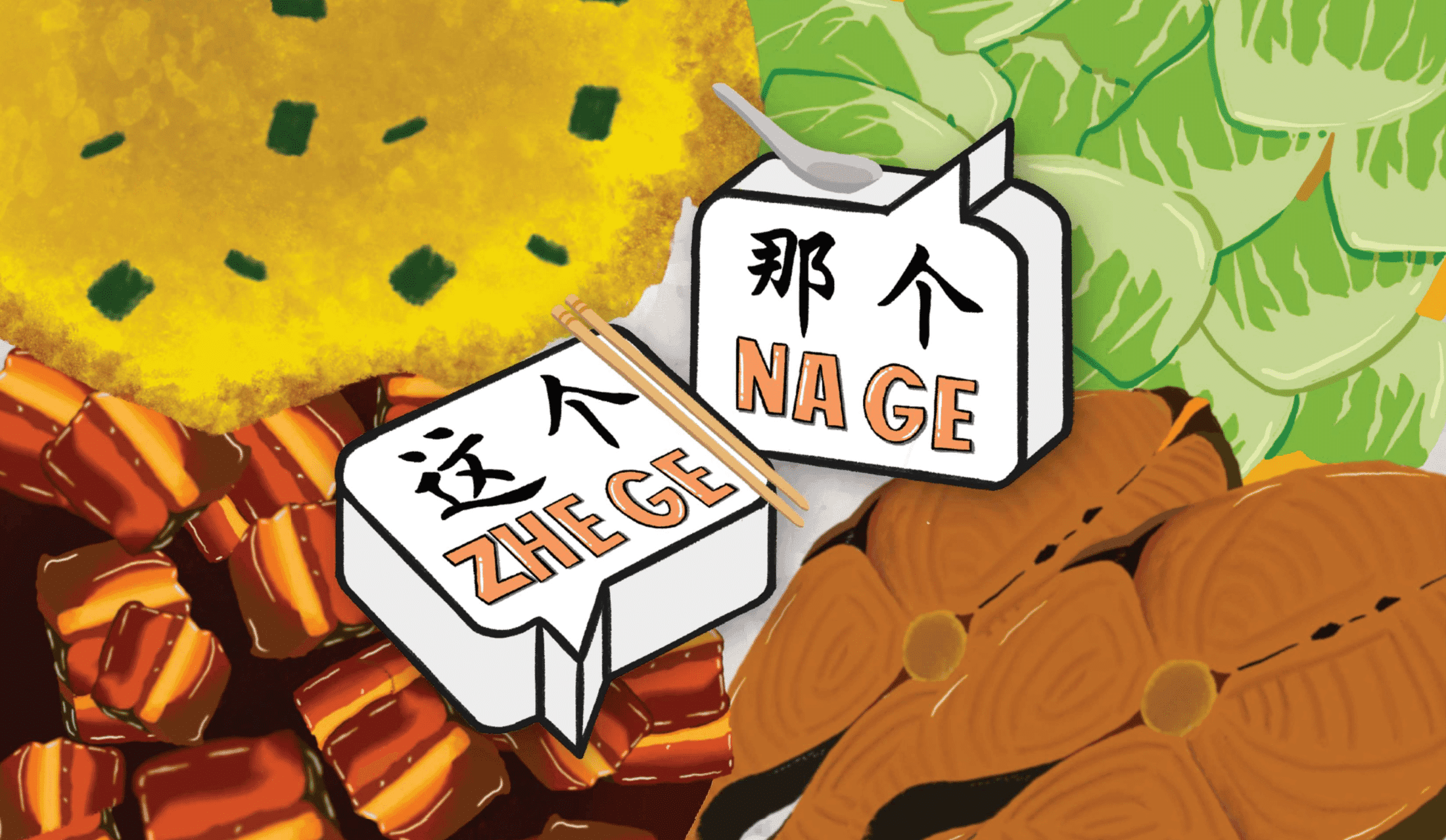
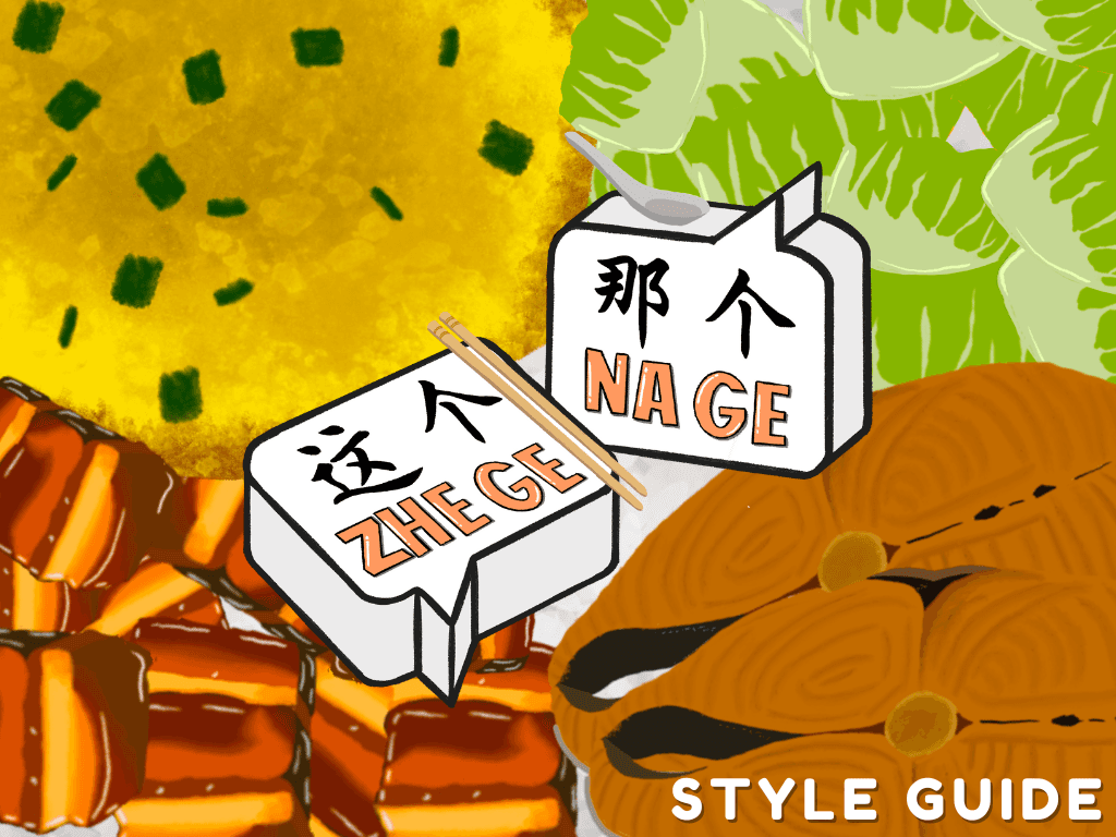
Zhe Ge Na Ge
Style Guide
The style is bold, playful, and rooted in Singaporean culture. A vibrant color palette inspired by plastic takeaway bags enhances local flavor, while clean, characterful typography ensures readability. Stylized illustrations of cai fan dishes and familiar visuals bring charm and cohesion to the game’s lighthearted tone.
UI Layout
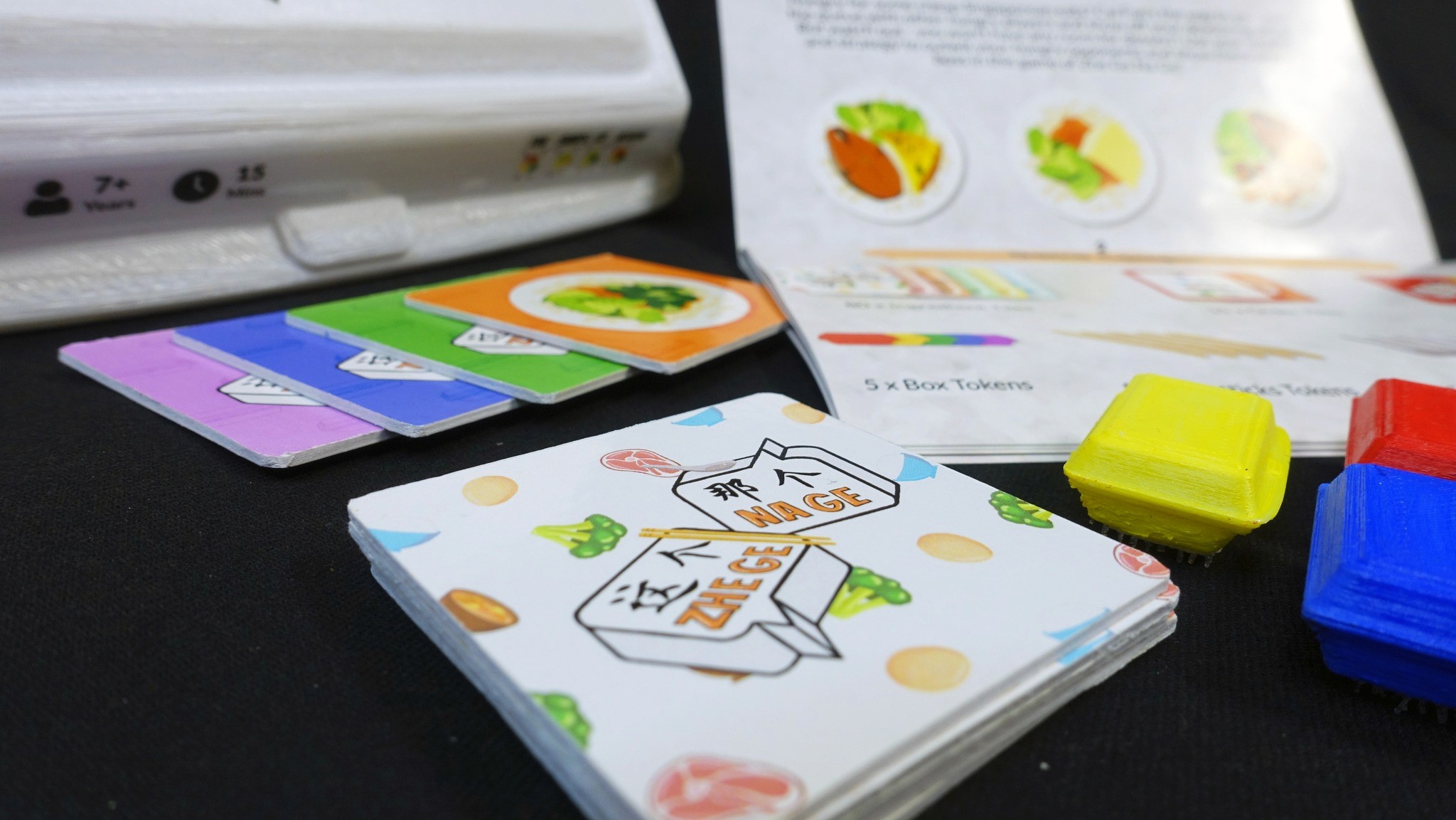
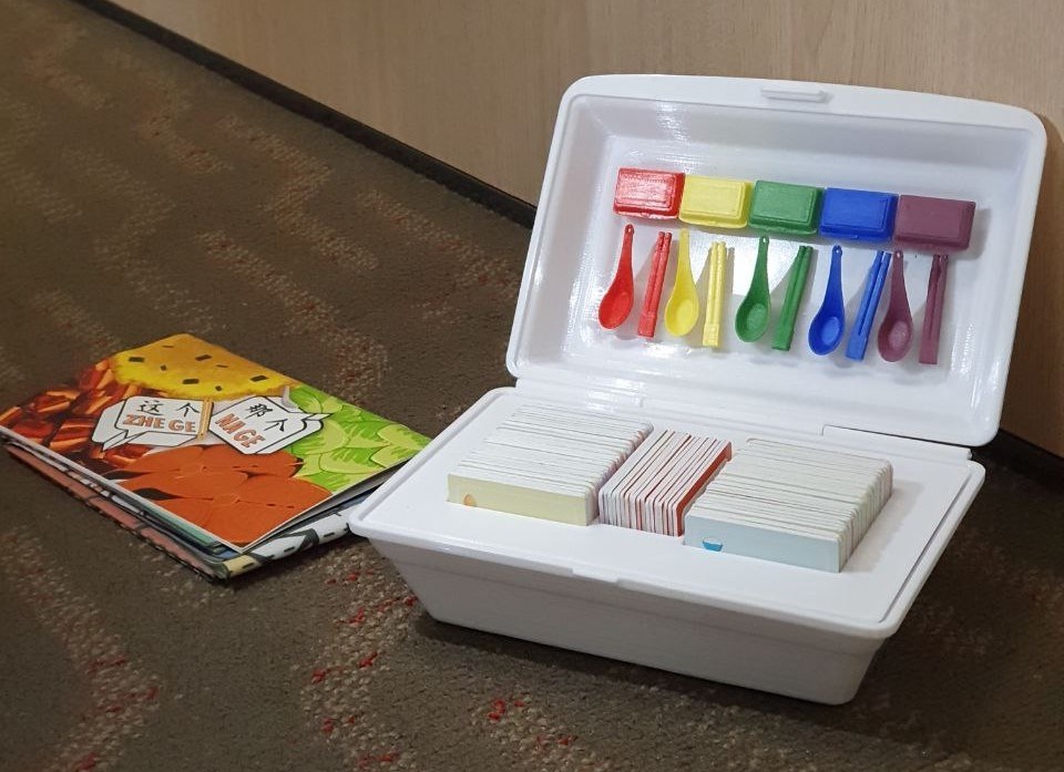
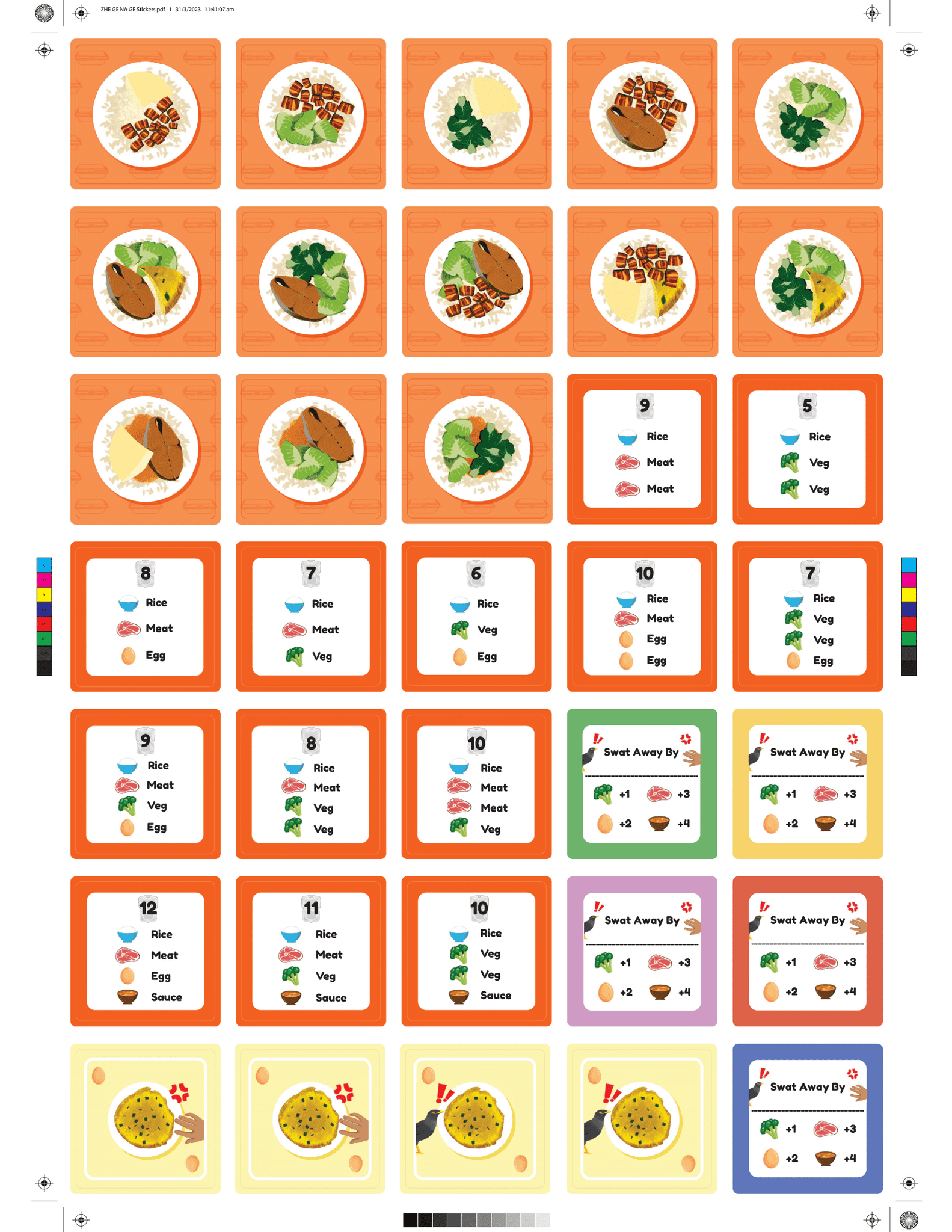
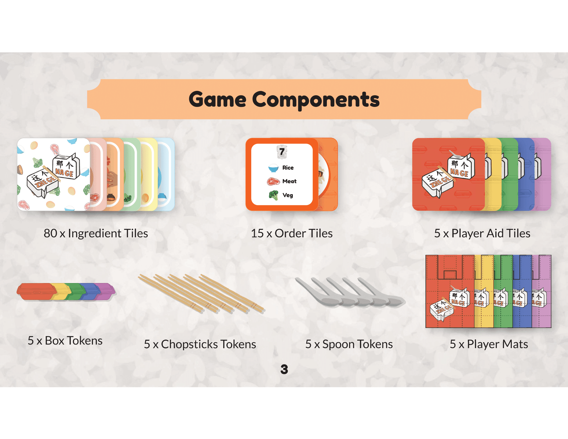
GAME CARDS
The game cards are inspired by Singapore’s cai fan culture, with each dish card representing familiar and beloved food combinations commonly found at mixed rice stalls.
Final Product
Zhe Ge Na Ge is a vibrant, culturally inspired game that combines playful visuals, local food culture, and immersive design elements, offering a fun and nostalgic experience through its unique packaging, tokens, and gameplay.
Key Takeaways
WHAT WENT WELL
Zhe Ge Na Ge successfully captured players' attention by incorporating local cultural elements, like Singapore’s cai fan and takeaway bag designs, creating an immersive and nostalgic experience. The vibrant visuals, familiar tokens, and intuitive layout enhanced the game’s accessibility and engagement, allowing players to quickly grasp its mechanics.
LESSONS LEARNT
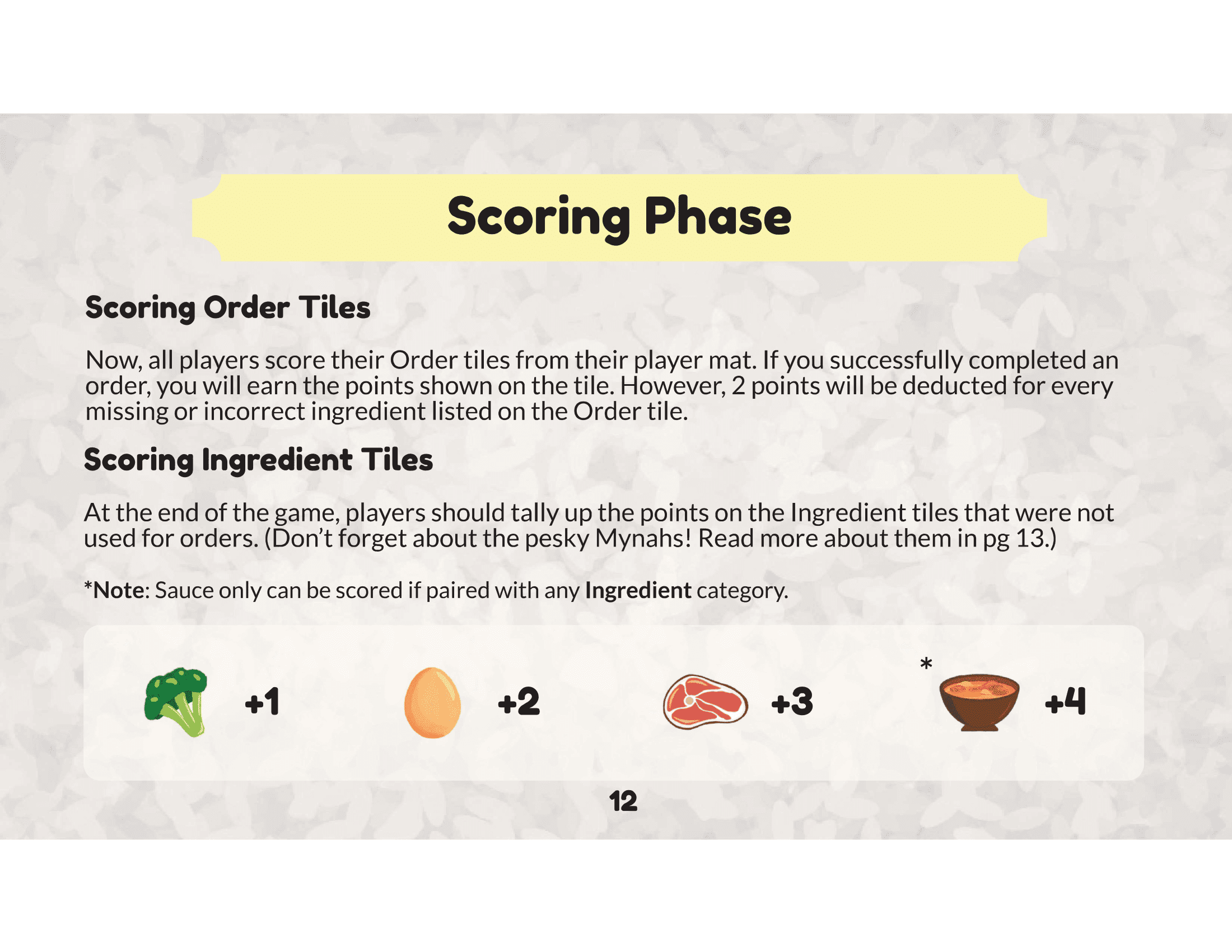
Through this process, we learned the importance of balancing cultural references with universal gameplay elements to appeal to a broad audience. Small details, such as the design of the packaging and the tokens, had a significant impact on the overall experience, highlighting the value of thoughtful design choices. We also learned that iterative testing and gathering feedback was crucial in fine-tuning the game to better meet player expectations, allowing us to create a product that was both enjoyable and visually cohesive.
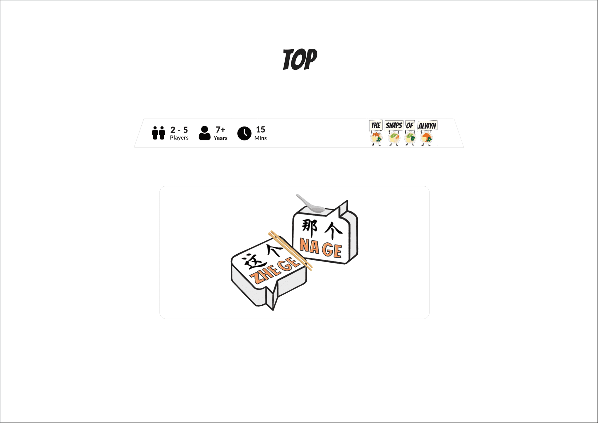
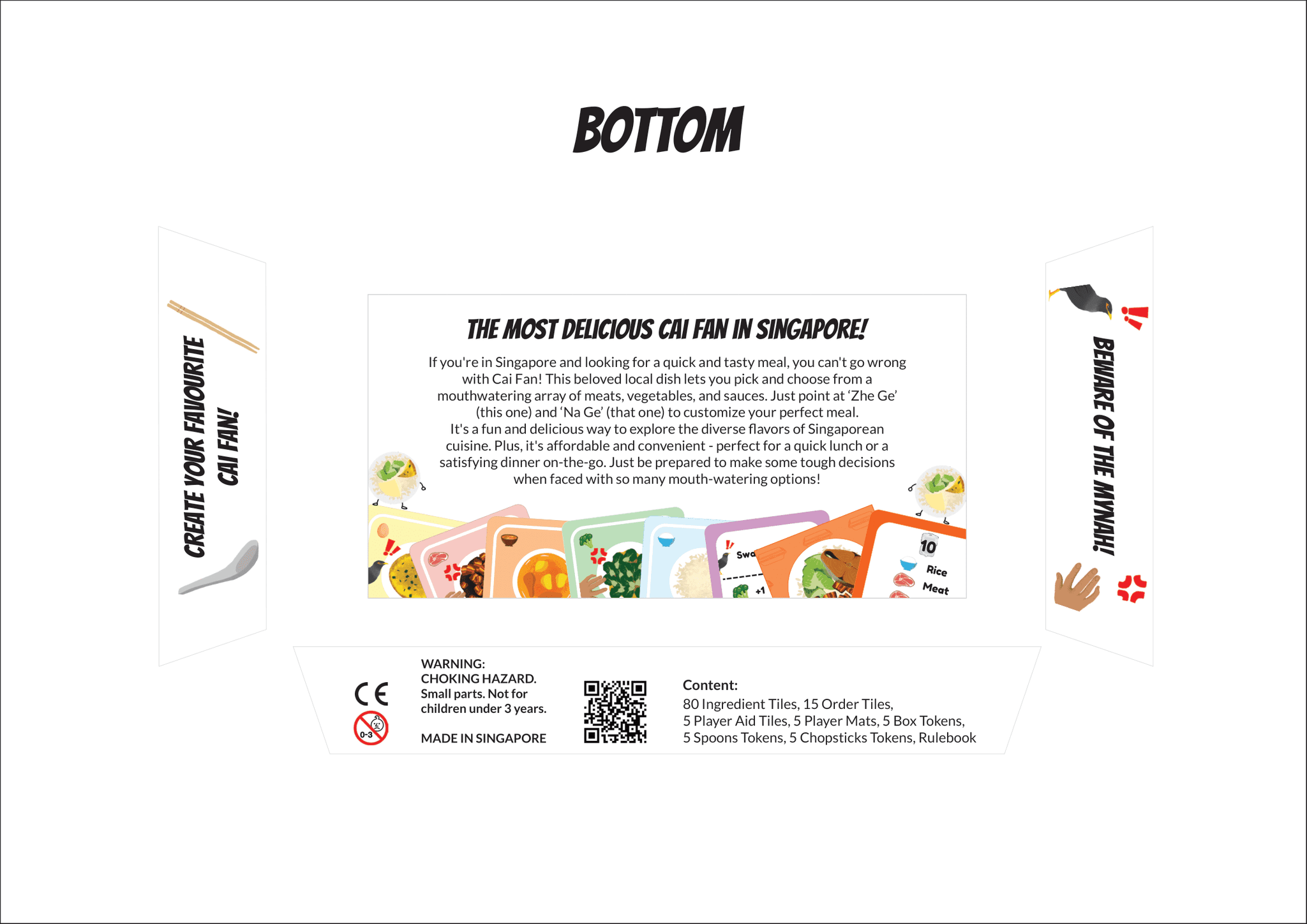
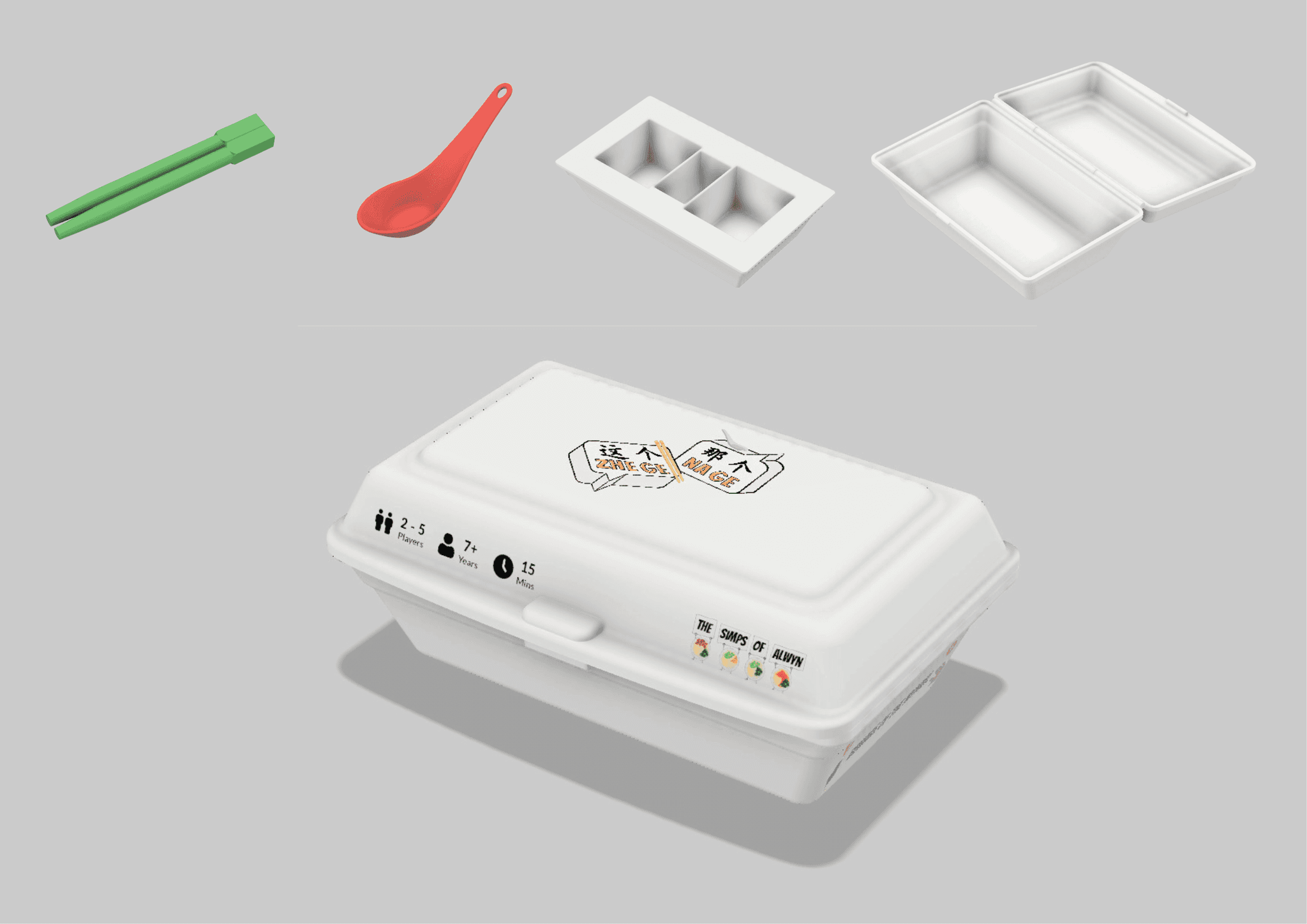
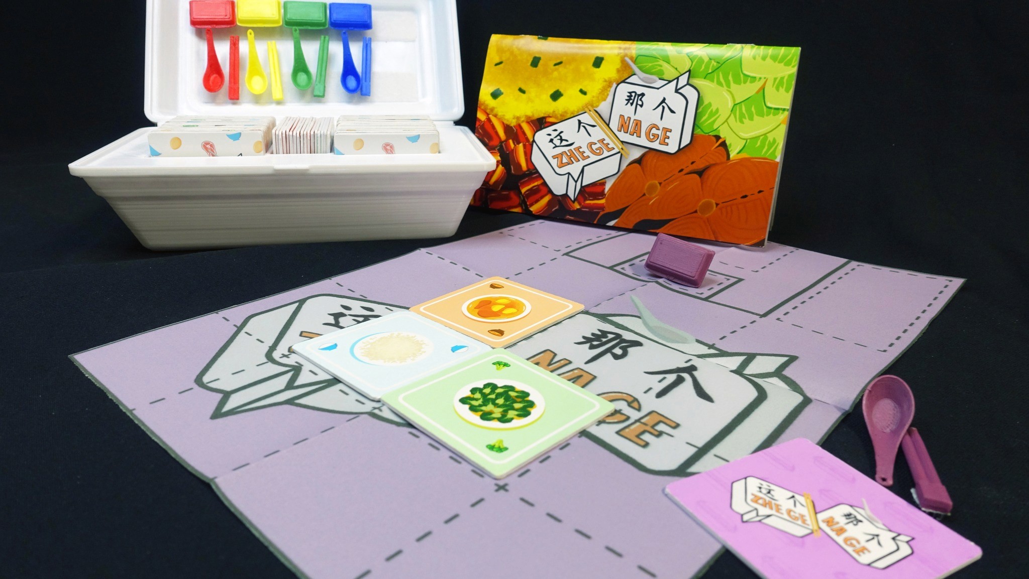
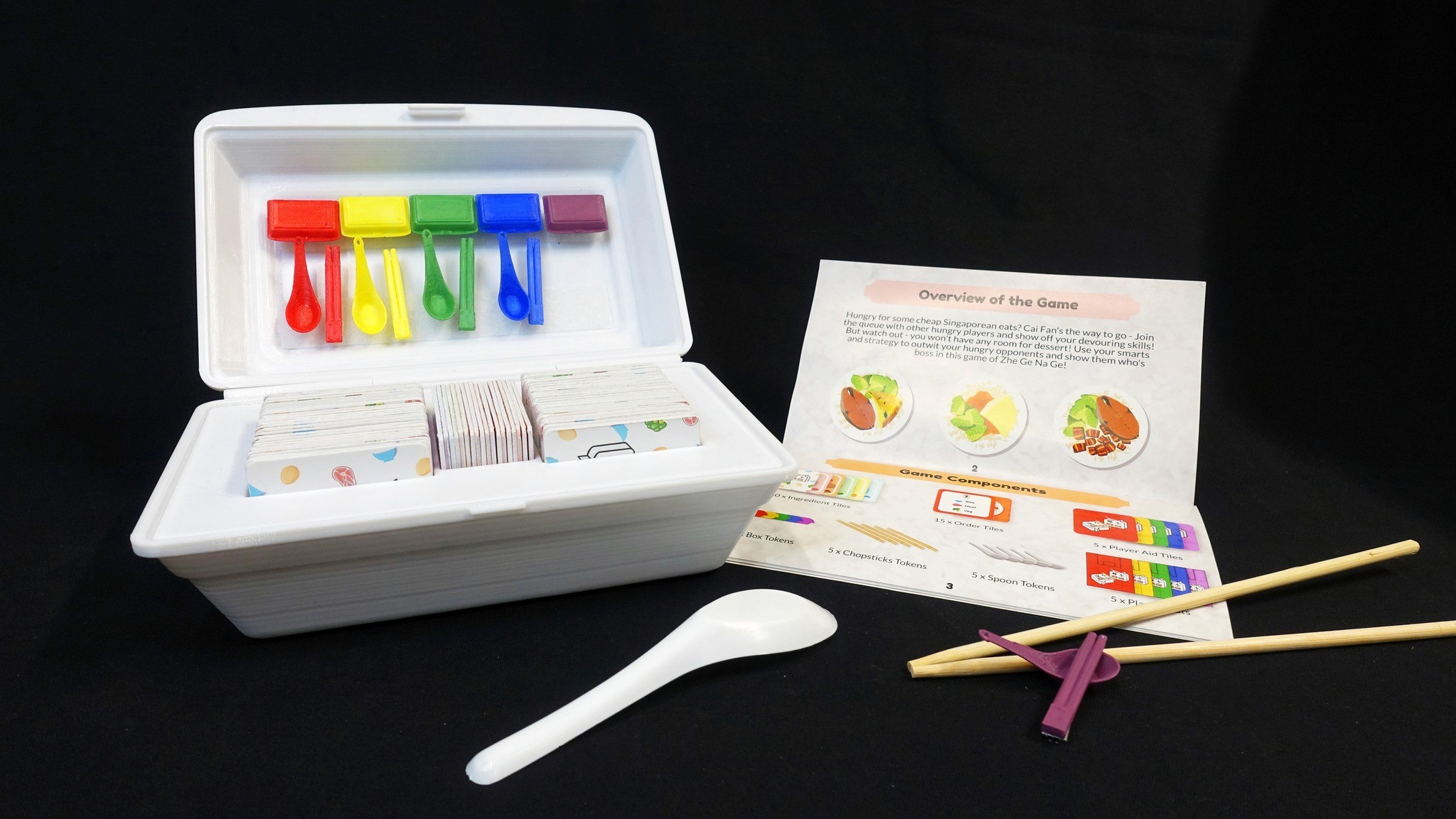
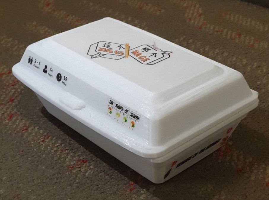
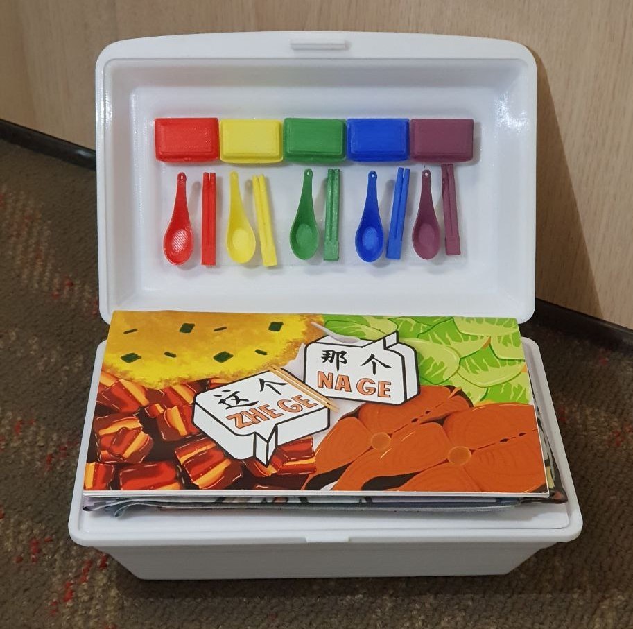
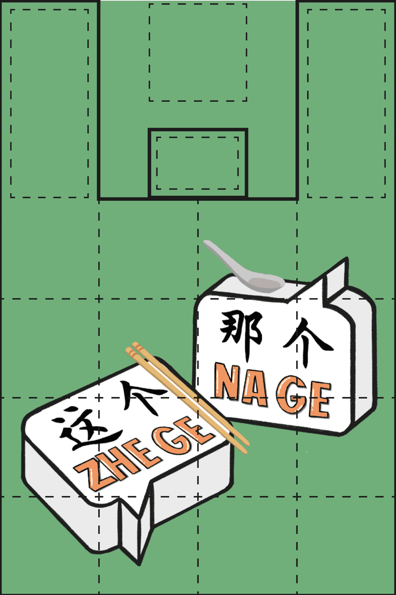
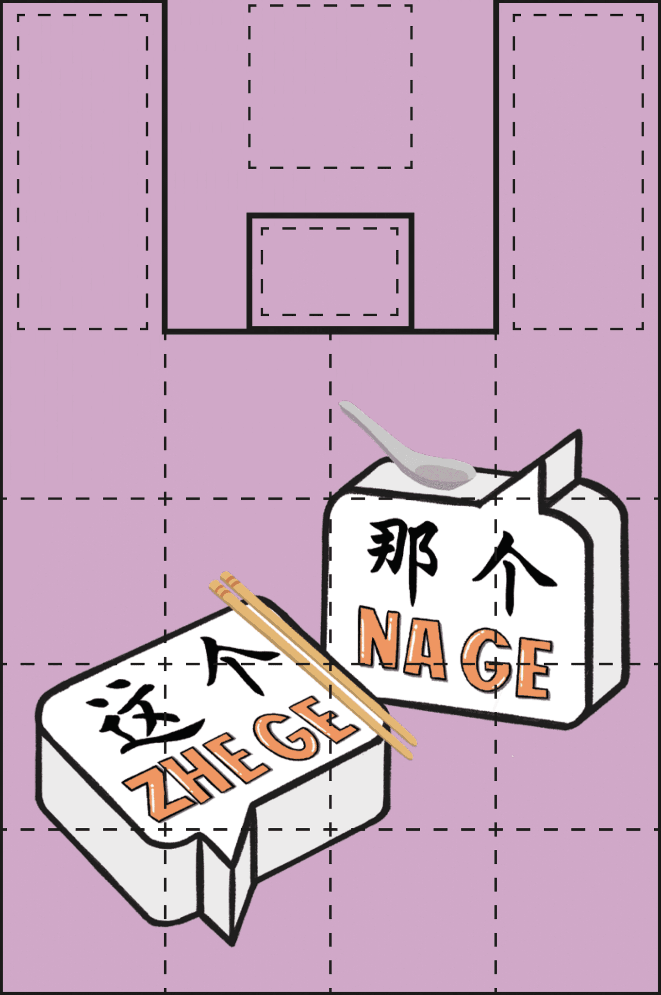
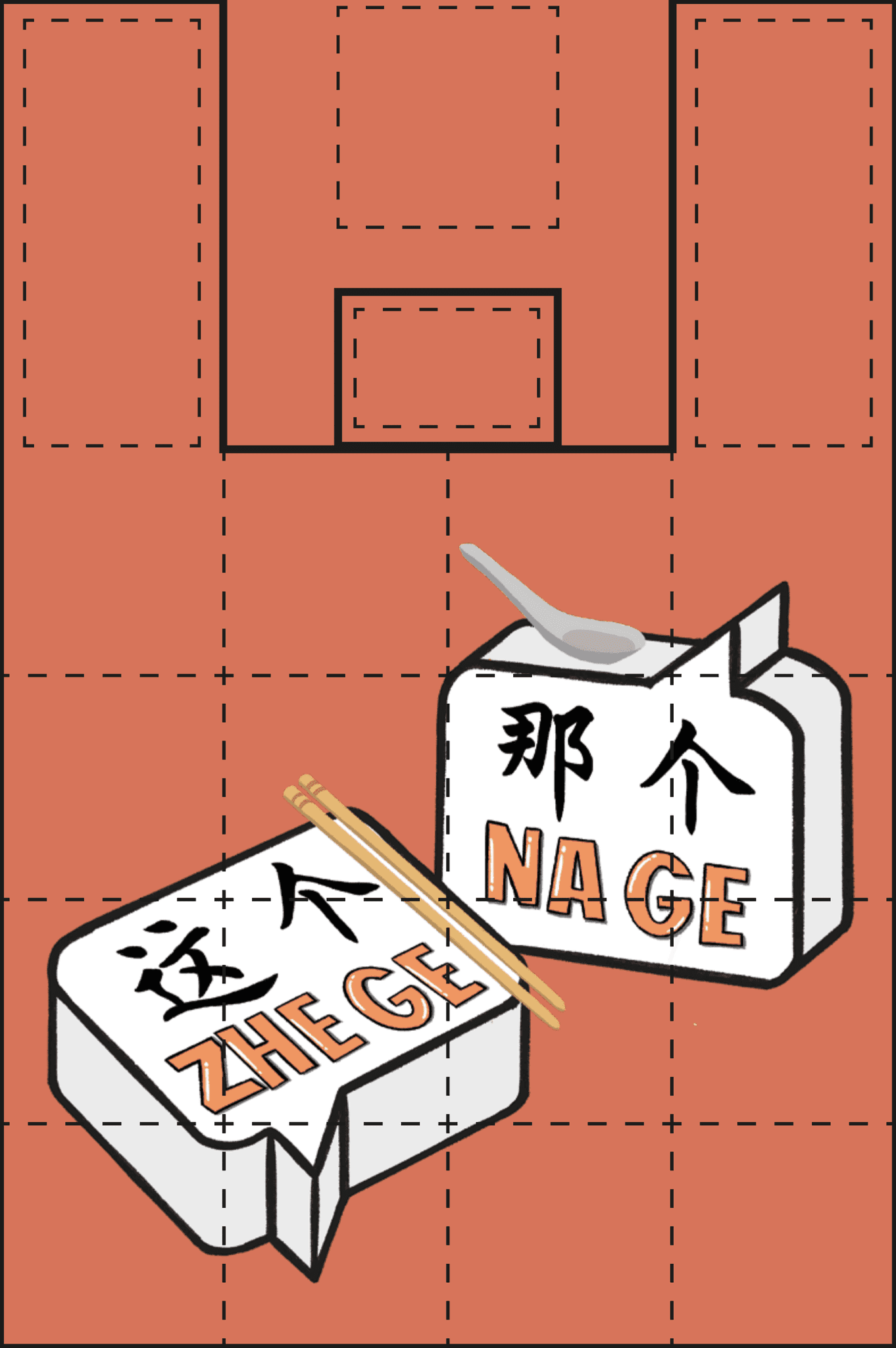
Packaging Design
The game box is designed to resemble a takeaway styrofoam container, adding a fun, nostalgic touch. Game tokens are also designed like Chinese spoons and chopsticks to add a playful, immersive touch rooted in local dining culture.
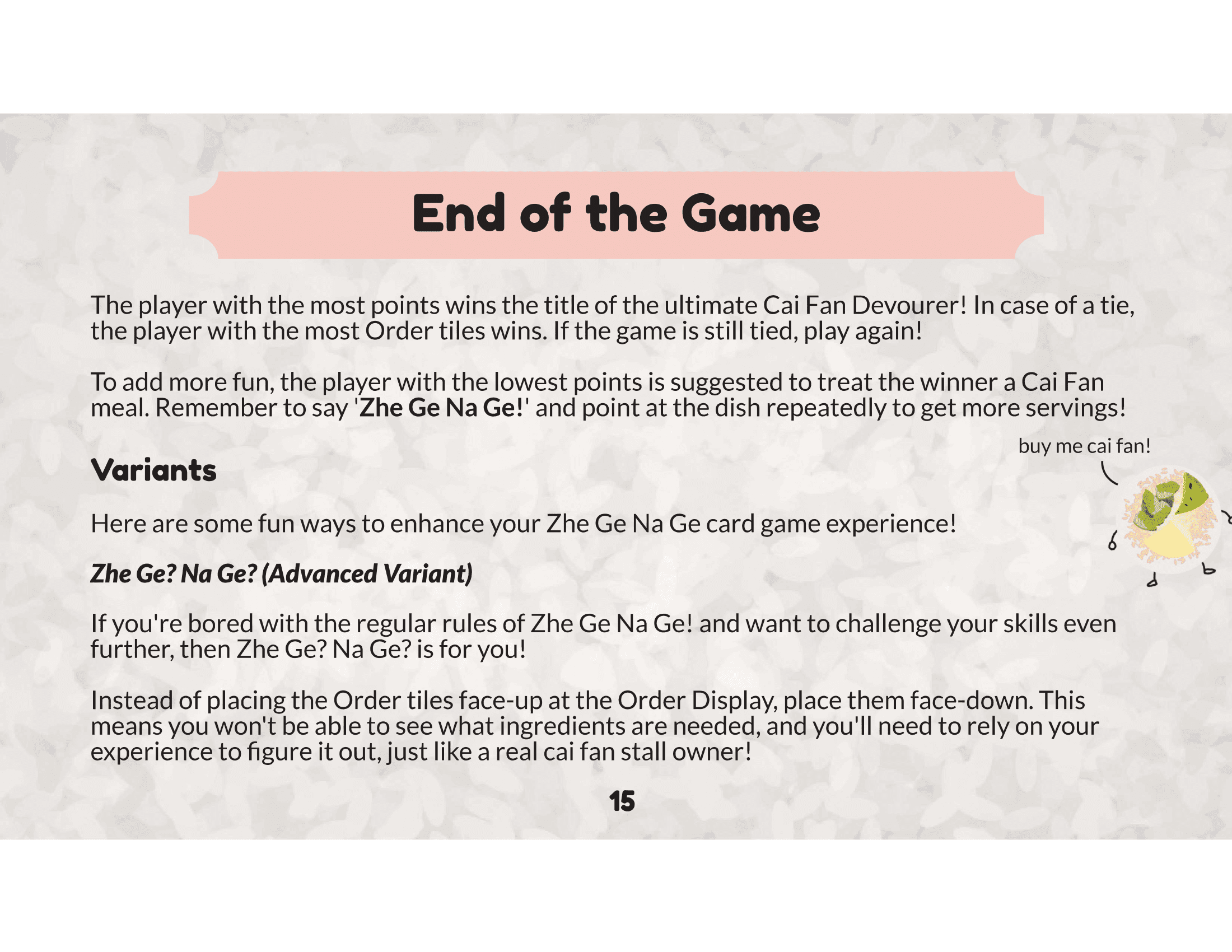
Rule Book
The rule book is designed with clear, easy-to-follow instructions, using playful visuals and local references to make learning the game both fun and accessible.
Project Overview
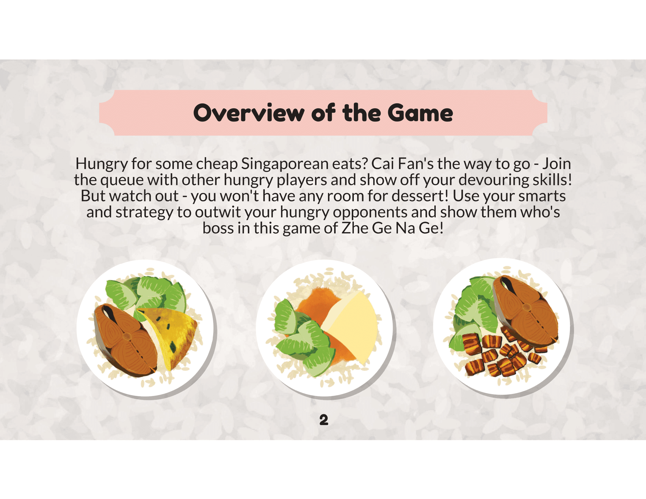
Zhe Ge Na Ge is a fast-paced, strategic card game that brings the thrill of Singapore’s cai fan culture to life. Players compete to collect ingredients, complete orders, and earn the title of the ultimate Cai Fan Devourer. With interactive mechanics like ingredient stealing and pesky Mynah birds to deal with, the game combines strategy, quick thinking, and a touch of humor.
Perfect for casual gamers and seasoned strategists alike, Zhe Ge Na Ge offers an immersive, competitive experience full of local flavor and excitement!
DETAILS
Genre: Card game, Strategy
Platform: Tabletop (Physical)
Team Size: 4
Tools Used: Figma, Adobe Illustrator, Fusion 360
FEATURES
Strategic ingredient collection
Interactive order completion
Tile-stealing mechanics
Mynah bird obstacles
Fast-paced simultaneous turns
Variant gameplay modes
My Contributions
PRODUCT MANAGER
Led the overall direction and vision of the game, ensuring all aspects of development aligned with the creative and functional goals. Managed team coordination and project timelines to deliver a cohesive gameplay experience.
LEVEL DESIGNER
Designed the core gameplay mechanics, ensuring they were engaging and intuitive. Focused on balancing the difficulty and pacing to provide an enjoyable experience for players of various skill levels.
CONCEPT DIRECTOR
Developed the initial concept for the 3D models, including key assets, such as the player tokens. Collaborated closely with the 3D art team to bring the visual design to life while maintaining artistic consistency.
UI DESIGNER
Designed the layout for in-game cards and contributed to the design of player mats, focusing on clarity, usability, and aesthetics to enhance the overall player experience. By ensuring both the interface and physical components were easy to navigate and well-organized, I aimed to support intuitive gameplay, allowing players to effortlessly track their progress and interact with game elements.
UI Layout
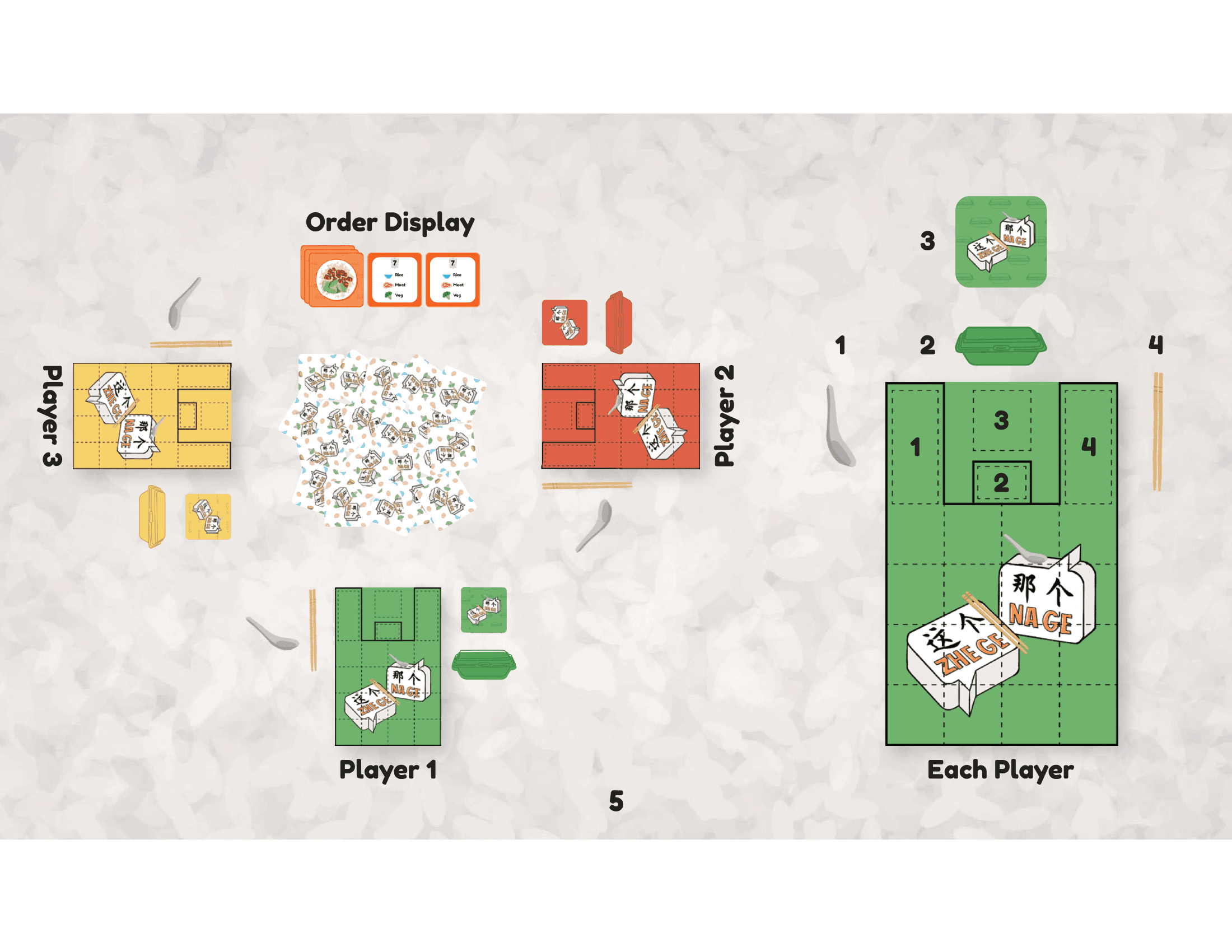
PLAYER MATS
To reflect Singapore’s iconic plastic bag culture, we designed the player mats using a color scheme inspired by commonly seen plastic bags, such as blue, red, purple, yellow, and green. The mat itself mimics the look of a takeaway bag, reinforcing the local theme through both color and design.
Style Guide
Page 1
Story, Vision, Mission
Page 2
Moodboard
Page 3
Moodboard
Page 3
Moodboard
Page 4
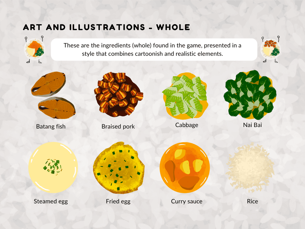
Art and Illustrations
Page 5
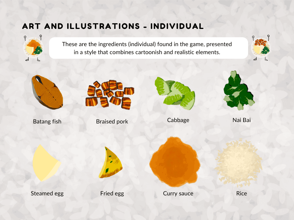
Art and Illustrations
Page 6
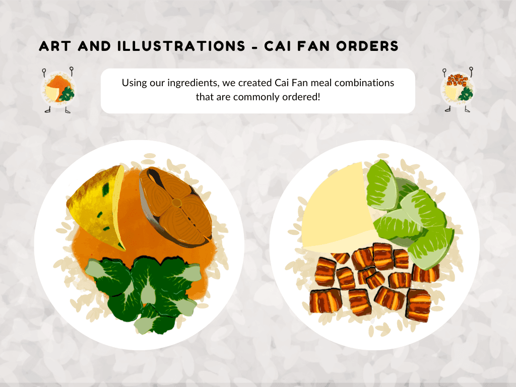
Art and Illustrations
Page 7
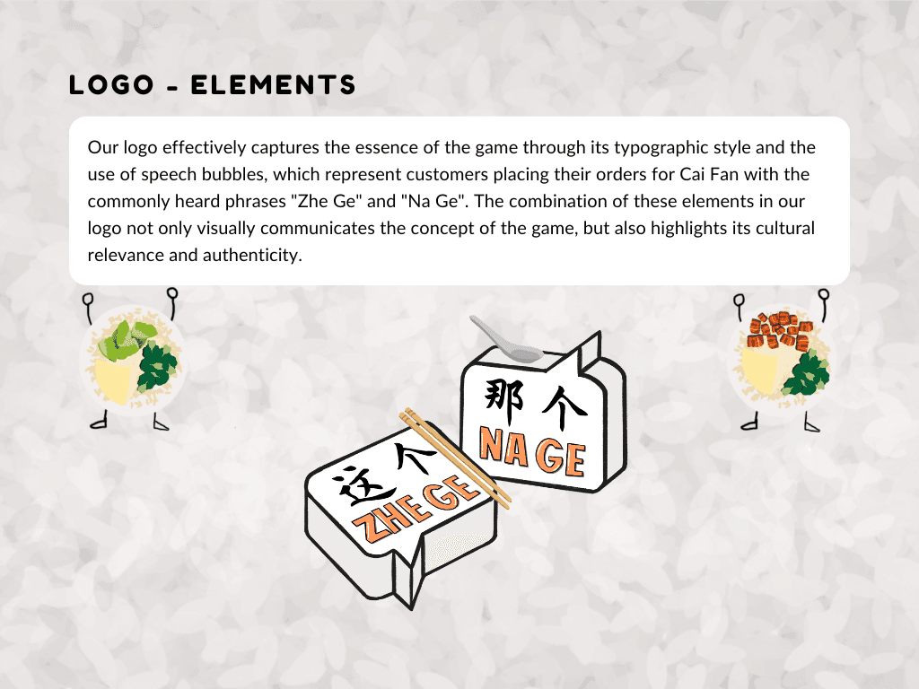
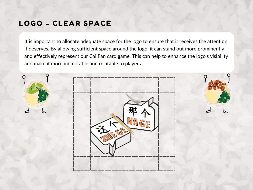
Logo
Page 8
Logo
Page 9
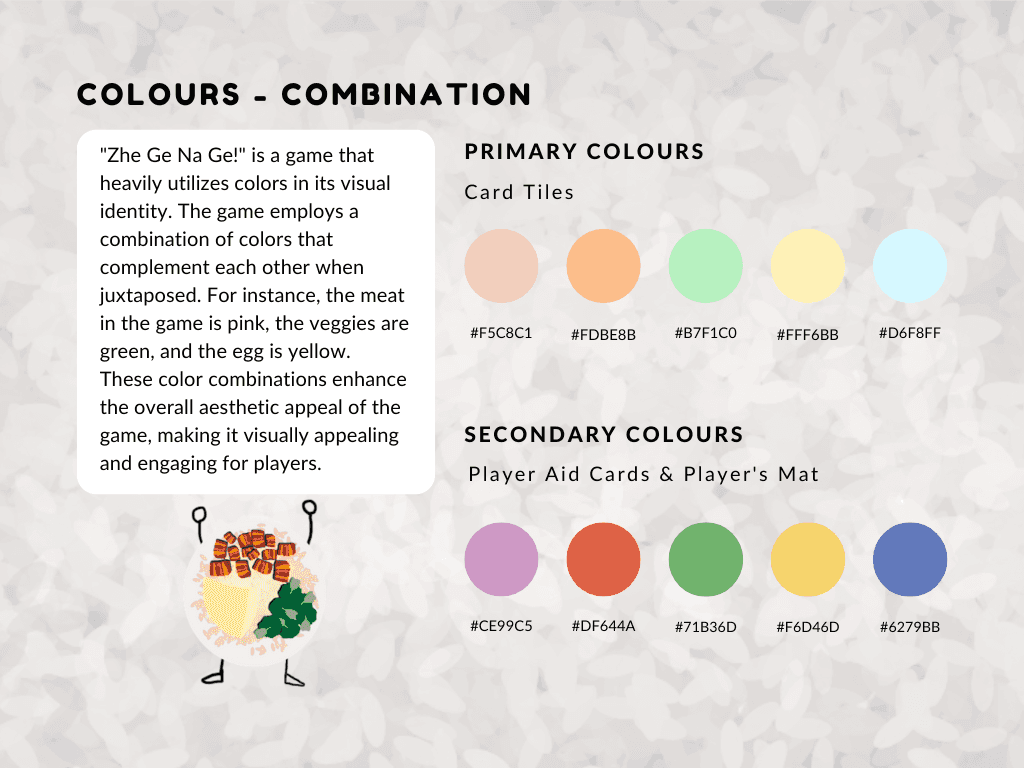
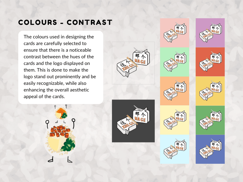
Colours
Page 10
Colours
Page 11
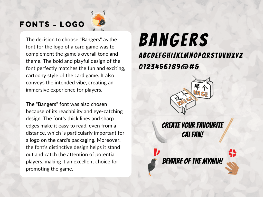
Fonts
Page 12
Fonts
Page 13
Fonts
Page 14
Fonts
Page 15
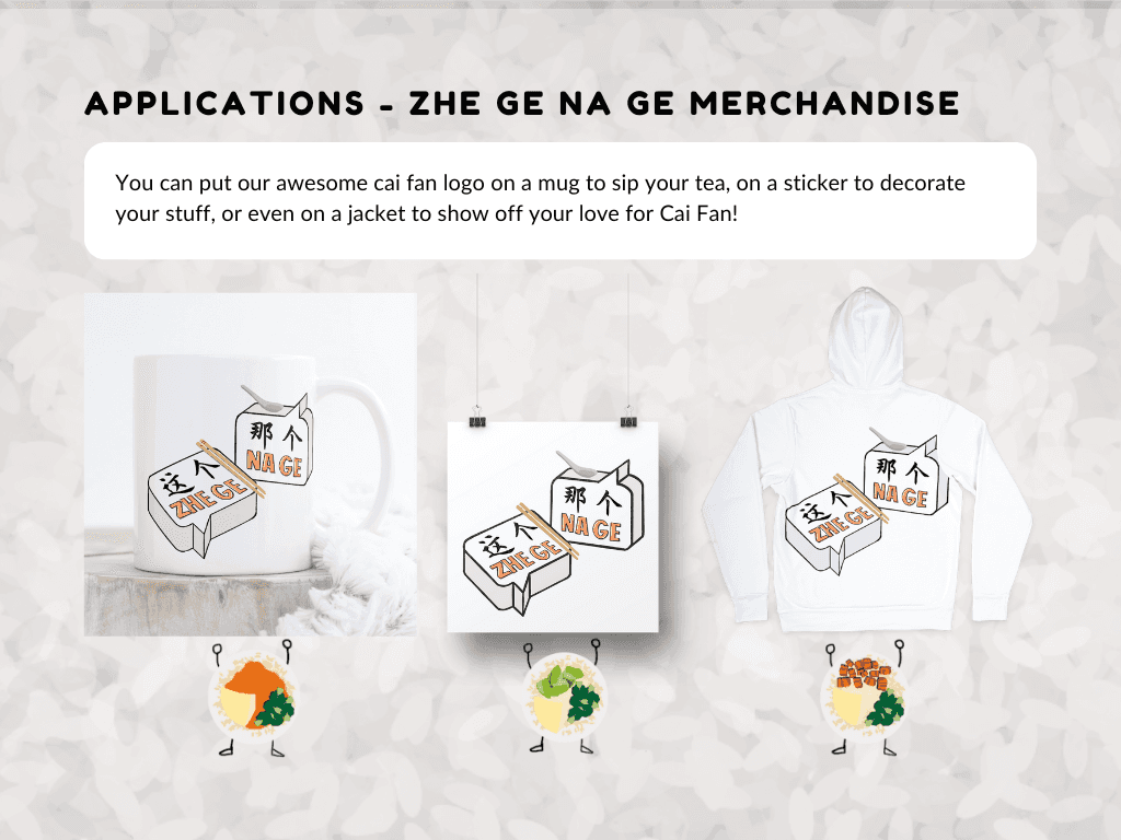
Merchandise
Page 16
Credits
Page 17

Style Guide
Page 1
Style Guide
Page 1
Style Guide
Page 1
Style Guide
Page 1
Style Guide
Page 1
Style Guide
Page 1
Style Guide
Page 1
Style Guide
Page 1
Style Guide
Page 1
Style Guide
Page 1
Style Guide
Page 1
Style Guide
Page 1
Style Guide
Page 1
Style Guide
Page 1
Style Guide
Page 1