Watsons Redesign
Analyze
THE MARKETPLACE
In a competitive health and beauty market, Watsons differentiates itself by providing personalized experiences and leveraging AR technology. However, the redesign ensures Watsons remains relevant by addressing usability challenges and incorporating user-driven enhancements.
By focusing on these improvements, Watsons can solidify its position as a leader in beauty and wellness while fostering customer loyalty.
USER JOURNEY AND USER FLOW
I created a user journey illustrating how users navigate the Watsons app, highlighting the emotional shift from curiosity to frustration when faced with confusing layouts or irrelevant product suggestions.
I then mapped out the user flow with a focus on the onboarding experience, ensuring a smooth transition from signing up to exploring product categories, applying filters, browsing items, and reading reviews.
Test
USABILITY TESTING
We conducted usability testing with a diverse group of users to evaluate various tasks, such as navigating features, selecting product recommendations, and using interactive tools like AR Beauty. The testing revealed multiple pain points, including challenges with navigation, lack of visual clarity, and insufficient guidance for key features. User feedback highlighted the need for a more streamlined experience with clearer instructions and better feature integration.
FEEDBACK
Navigation was confusing and unintuitive, particularly between overlapping features like "KnowMe" and "Product Finder."
Interactive elements, such as buttons and product options, were unclear and difficult to distinguish.
Users encountered challenges with essential prompts, such as enabling the camera for AR Beauty.
The onboarding process was too lengthy, creating a tedious experience for new users.
Product recommendations lacked depth and personalization, leaving users dissatisfied.
SOLUTION
Redesign the navigation structure with a clearer hierarchy and improved feature distinctions.
Enhance visual clarity by making buttons, product options, and interactive elements more recognizable.
Implement prompts and guidance for features like AR Beauty to ensure seamless interaction.
Streamline the onboarding process to make it shorter and more user-friendly.
Enrich the "KnowMe" feature with detailed, personalized product recommendations based on user needs and preferences.
Final Design
WATSONS REDESIGN PROTOTYPE
Key takeaways
WHAT WENT WELL
The AR Wayfinding feature received high praise from local testers, who found it innovative and easy to use. Local user testers highlighted it as one of the most impressive aspects of the app, showcasing its intuitive functionality and innovative design.
LESSONS LEARNT
The project provided valuable hands-on experience, especially in integrating AR functionality and managing user feedback cycles. We learned the importance of prototyping with more features to identify potential usability issues early and provide a more robust user experience during testing.
This project emphasized the necessity of deeply understanding user needs and preferences, enabling us to align our features more closely with their expectations.
Design
LOW FIDELITY WIREFRAMES
I started with low-fidelity wireframes to explore various layout and navigation concepts, focusing on onboarding, profile setup, personalized product recommendations, and the integration of AR Beauty features.
MID FIDELITY WIREFRAMES
Next, I developed mid-fidelity wireframes to refine the structure and incorporate key elements like category browsing, filtering options, and interactive AR touchpoints.
HIGH FIDELITY WIREFRAMES
Finally, I created high-fidelity screens and built an interactive prototype in Figma to simulate the user experience and gather valuable feedback through usability testing—particularly around the AR Beauty flow and its impact on product discovery.
Project Overview
Watsons is a prominent health and beauty retailer, and its mobile app aims to serve as a holistic platform for product discovery, personalized recommendations, and seamless shopping experiences.
The redesign focuses on addressing usability challenges, enhancing navigation, and integrating innovative features that cater to both casual users and loyal customers.
By creating a more engaging and intuitive interface, the app aspires to strengthen user engagement and reinforce Watsons' position as a go-to beauty and wellness destination.
TIMEFRAME
4 weeks
MY ROLE
UX + UI Design, Visual design, Branding, User flow, Research, Prototyping + Testing
TOOLS
Figma, Fig Jam, Google Forms
Define
THE PROBLEM
The Watsons app faces several challenges that significantly impact its user experience. Navigation is a key issue, with users finding it difficult to distinguish between overlapping features such as "KnowMe" and "Product Finder." Additionally, the app’s poor visual clarity—such as indistinguishable buttons, color options, and product shades—further diminishes usability and creates frustration.
Redundant elements like transaction history also clutter the interface, while the lengthy onboarding process creates a cumbersome experience for new users.
Moreover, the "KnowMe" feature falls short of providing personalized, actionable product recommendations. Users expressed a need for more in-depth insights and tailored advice to make informed decisions. These pain points highlight the necessity for a strategic redesign focused on improving navigation, enhancing visual clarity, and delivering a more personalized, user-centric experience.
THE OBJECTIVE
Create a more intuitive and visually appealing interface.
Simplify navigation between features like KnowMe and Product Finder.
Add meaningful feedback and prompts to improve feature usability.
Streamline essential functionalities and remove redundant elements.
THE GOAL
How can we redesign the interface for better usability and visual clarity?
What improvements are needed to simplify navigation and streamline interactions?
How can we provide richer, more actionable product recommendations?
Which redundant features can be removed, and which ones should be enhanced for relevance?
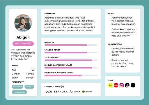
Research
For the Watsons redesign, we conducted extensive user research through surveys, interviews, and usability testing with a diverse group of app users. The research focused on understanding their navigation challenges, preferences for product recommendations, and overall expectations from the app experience.
NEEDS
A clear and intuitive user interface that simplifies navigation.
Accurate and detailed product recommendations based on user preferences and skin analysis.
Seamless functionality with essential prompts.
WANTS
Enhanced search functionality for quick and easy access to products and features.
Simplified onboarding process to improve the user experience for new users.
Streamlined booking or purchase processes with fewer steps and improved clarity.
DESIRES
Personalized recommendations that highlight both suitable products and ones to avoid.
Integration with features like AR Beauty for a more interactive experience.
Visually cohesive design with clearly defined interactive elements.