WhoCares
Analyze
THE MARKETPLACE
In the realm of volunteer applications, SGCares stands out with its government support, promoting kindness and community engagement in Singapore. Its emphasis on inclusivity and diverse volunteer opportunities, along with robust training resources, resonates with a wide audience. The official backing of SGCares provides a reliable platform for individuals and organizations to make a meaningful impact.
Comparatively, WhoCares aims to address specific challenges in the eldercare sector by providing a user-friendly platform that encourages community involvement and support, focusing on creating an efficient and engaging experience for volunteers in this niche area.
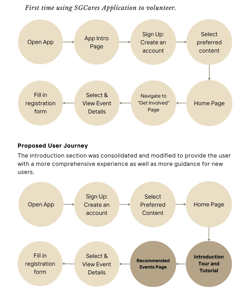
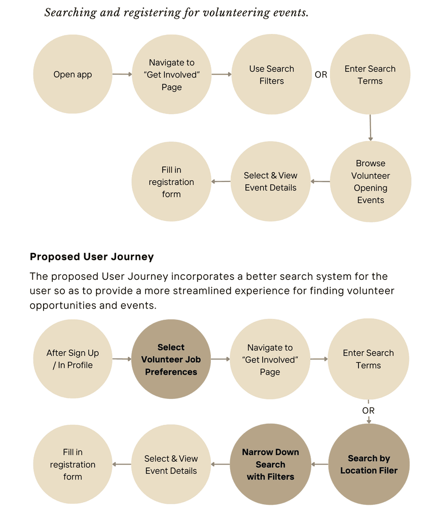
USER JOURNEY AND USER FLOW
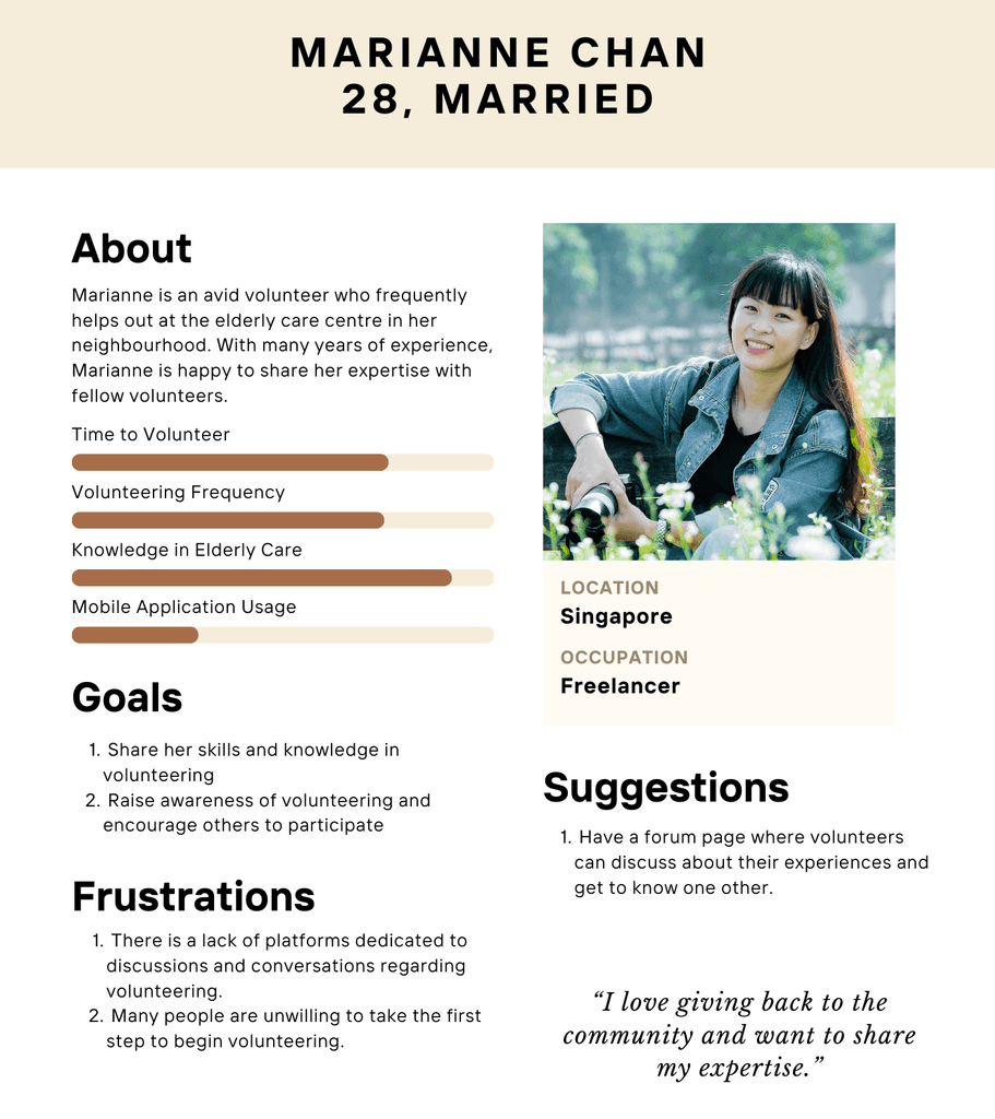
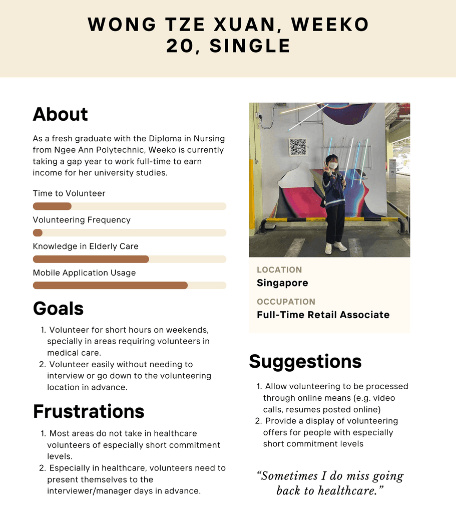
To ensure the WhoCares app effectively addressed the needs of the eldercare sector, we created detailed user flows and user journey maps that reflected the goals and challenges of key users, such as volunteers, staff coordinators, and caregivers. These flows outlined essential tasks such as discovering opportunities, signing up based on skills and availability, and tracking participation.
We then mapped emotional touchpoints throughout the volunteer experience—from onboarding to active involvement—to identify pain points and improve engagement. This process allowed us to design a more intuitive, purposeful platform that fosters stronger connections and support within the eldercare community.
Test
USABILITY TESTING
A diverse group of users were interviewed regarding various tasks within the app, such as booking facilities, adding family members, and navigating through different sections. The testing revealed several areas where users encountered difficulties, particularly in terms of navigation and the booking process. Feedback indicated that users were looking for a more streamlined experience with fewer steps and clearer instructions. The testing also highlighted the need for a more responsive and intuitive interface.
FEEDBACK
The purpose of the map button is not immediately apparent, and its placement on the interface makes it easy to overlook.
The sign-up process does not clearly communicate the specific skills or qualifications needed for each volunteer opportunity.
The current typography is difficult to read, especially on smaller devices.
SOLUTION
Positioned the map button near the top of the interface, alongside other filter options.
Removed the black outlines from buttons and aligned all UI elements with the existing orange color palette.
Implemented an interactive pop-up that appeared when users hovered over or tapped on a skill tag.
Adjusted the font size across the interface to ensure comfortable reading, especially for older users or those with visual impairments.
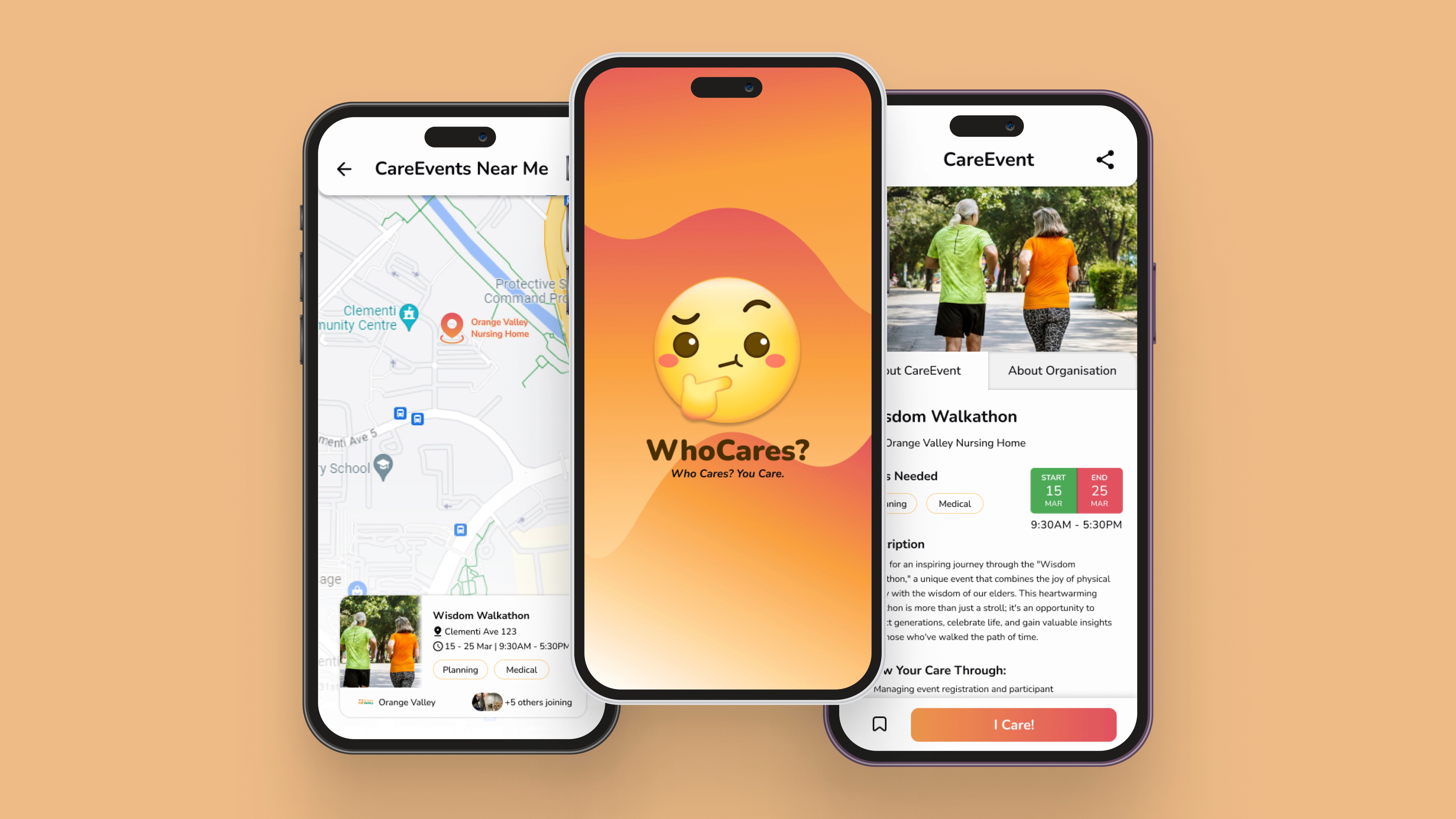
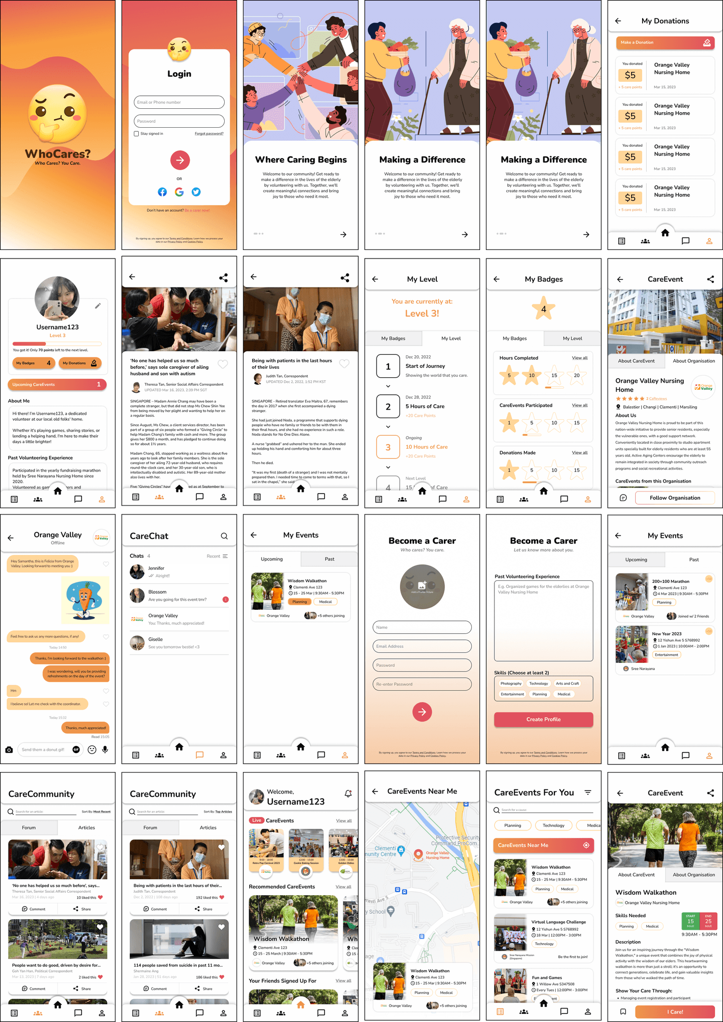
Final Design
ACTIVESG PROTOTYPE
Key takeaways
WHAT WENT WELL
WhoCares effectively created a user-friendly platform for youths to easily discover and join volunteer opportunities. The intuitive design, simple navigation, and personalized recommendations helped users quickly browse and find opportunities that suited their interests. The clear onboarding process and relevant filters contributed to strong user engagement and retention.
LESSONS LEARNT
We learned the importance of making the app’s core features easily discoverable and reducing friction in the user journey. While the app’s initial design was clean, testing revealed that users needed more guidance during onboarding to better understand the app’s full range of features. Simplifying the filtering process and adding more informative tooltips improved usability. Another lesson was the need for continuous feedback loops to ensure the app evolves in alignment with user needs.
Design
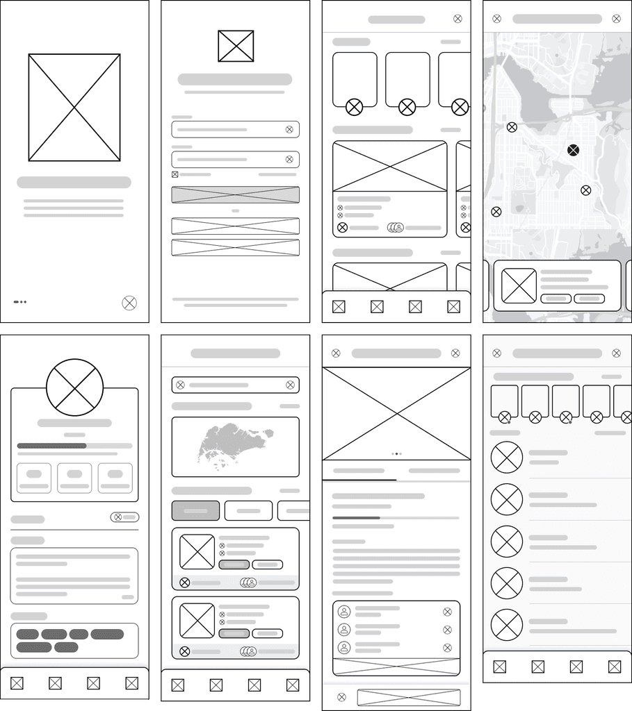
LOW FIDELITY WIREFRAMES
We began with low-fidelity wireframes to explore layout and navigation ideas, focusing on key features like a community board, event discovery, volunteer meet-up creation and sharing, a donation page, and in-app messaging between volunteers and organizers.
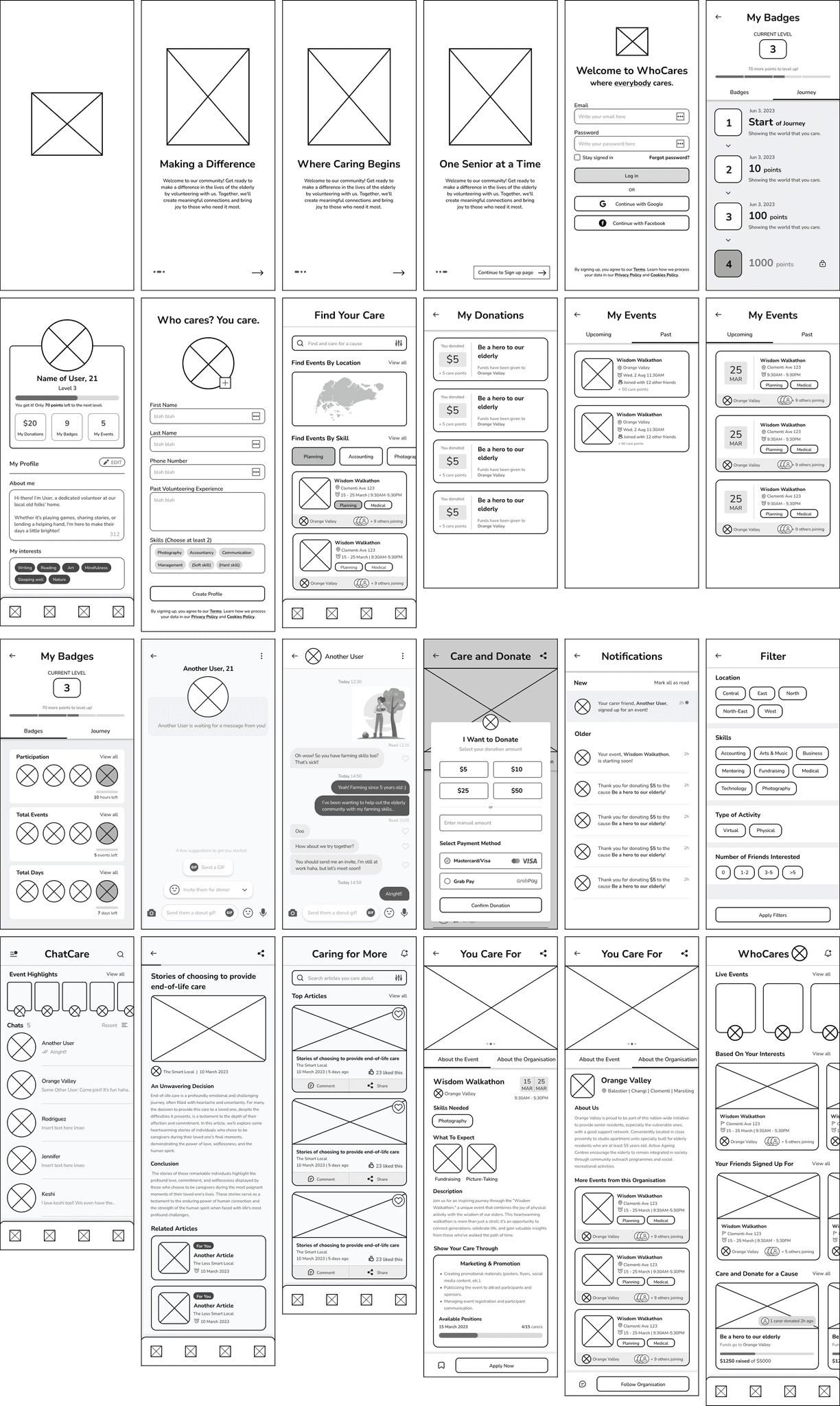
MID FIDELITY WIREFRAMES
In the mid-fidelity stage, we refined these flows to support browsing and signing up for events, sending and receiving messages, and tracking donations. We also designed a gamification system where users could earn badges and recognition based on the number and types of activities they completed.
HIGH FIDELITY WIREFRAMES
Finally, we developed high-fidelity screens and built an interactive prototype in Figma to simulate these features. Our goal was to design an intuitive, motivating, and community-driven experience that encourages continued volunteer participation through clear communication, impact tracking, and rewarding contributions.
Project Overview
The WhoCares project embarked on a journey from the spark of an idea to the final stages of interaction and prototyping.
It was born out of a deep understanding and concern for the challenges facing the eldercare sector in Singapore, specifically addressing the critical shortage of manpower and the pressing need for a more unified and effective care network.
The project's core was to develop a user-friendly app that simplifies volunteering in eldercare, aiming to improve service organization and relieve sector pressures.
TIMEFRAME
4 weeks
MY ROLE
UX + UI Design, Visual design, Branding, User flow, Research, Prototyping + Testing
TOOLS
Figma, Fig Jam, Google Forms, Canva
Define
THE PROBLEM
The eldercare sector is facing a growing strain due to a shortage of staff and increasing demand, particularly as the government plans to roll out over 200 active aging centers in the next three years. To meet these demands, there is a pressing need for a more integrated and efficient care network that can offer reliable, comprehensive support for the elderly.
A major challenge is the lack of skilled and consistent volunteers. Many volunteers are unable to commit long-term or lack training for specialized care, which affects the quality and continuity of support. Staff also face difficulties managing and matching volunteers to residents' needs, making coordination resource-intensive and less effective.
THE OBJECTIVE
Ensure easy access and navigation on various devices with a responsive design.
Develop a user-centered search system with tailored parameters for individual preferences.
Provide an engaging experience for volunteers with a dynamic interface and multimedia content.
Foster a supportive community of volunteers through social interaction and feedback.
THE GOAL
How can we ensure that our platform is accessible and easy to navigate on various devices?
How can we create an engaging and informative experience that educates and inspires volunteers?
How can we streamline the user experience to make finding and connecting with volunteer opportunities more efficient?
How can we build a supportive community of volunteers and facilitate social interaction and knowledge sharing?
Research
To gain insights into the volunteering preferences and challenges faced by Singaporean youth, we conducted user surveys focusing on their demographic information, platform experiences, and past volunteering experiences.
NEEDS
Clear and concise program outlines on volunteering platforms.
Efficient sign-up processes with shorter processing times.
Platforms that offer a variety of interesting volunteering opportunities.
Adequate resources and manpower to ensure a pleasant volunteering experience.
WANTS
Opportunities to engage in activities such as games, arts and crafts, and entertainment while volunteering in elderly care.
Volunteering platforms with clearer job descriptions and filtering systems.
Platforms that provide convenience in finding and applying for volunteer opportunities.
DESIRES
A sense of fulfillment from volunteer work.
The ability to effectively communicate with the elderly, regardless of language barriers.
To overcome challenges related to timing and location when committing to volunteer work.